DIY pages allow you to create a basic online donation page that is linked to a giving option. The process is fairly intuitive once you understand the basics and it allows you to be as creative or as basic as you would like. Since the Donation Page is linked to a Giving Option, the first step in this process is to set up that giving option. See that section for more information on
Giving Options.
You will also see that a Donation Page needs a Confirmation page. That is the page that donors will see once they have completed their donation. See that section for more information on the
Confirmation Page.
Page Layout
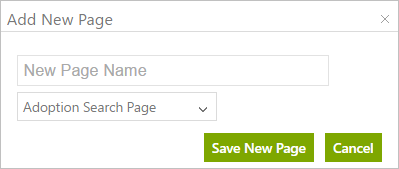
Once logged in, click the Pages link at the top of the page. Here you see a list of existing templates. You can choose one of these and use it as is or modify it if necessary by clicking the Edit button on the right. Or, you can create a new template. Click the Add New Page button.
Give the page a
Name. We also need to select the
Type of Page it will be and we’ll choose Simple Giving Page for now although we can also create other pages like
Confirmation Pages,
Volunteer Pages, and
Adoption Pages, and
Peer To Peer Pages, which are covered in their own sections.
Click to Save the new page. This now returns you to the main page showing all of your templates including your new template.
Click the Edit button to set up your new page.
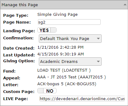
The right section of the page is the Layout Editor with several of the elements called ‘Controls’ displayed on the page. The left side of the page contans several sections with the top one being the 'Manage this Page' section.
The first thing you need to do is
link this page to a giving option by clicking in that field and selecting one that you have previously set up. A
Giving Option is a project or anything you’d like to offer to the donor for donations and will be covered in a separate section.
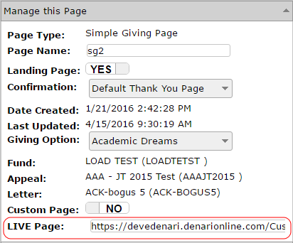
Below the giving option field is the Live Page field. It shows the URL that you will eventually use for this page. You can link to this page from your web site, include it in an email, etc. Any gifts to this page will link back to the settings from the giving option. It is best to use this URL during the setup process to see exactly what the page will look like. Hit CTRL - C on your keyboard to copy it. Now open a new tab and paste that there and you can now see the finished project in your browser.
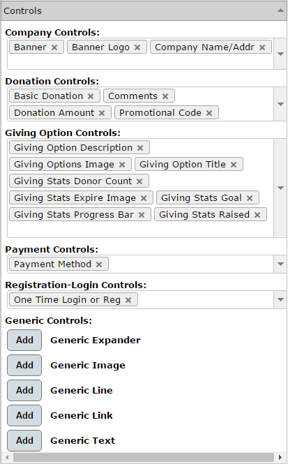
As mentioned earlier, the elements on the page are called Controls and there are some already in the layout editor to get you started. You can turn them off by right-clicking on the Control and choosing Hide Control. You also have a Controls section on the left side of the page.
You can also turn of controls by clicking the X next to each control. Doing that removes the control from the Layout Editor. You can add controls to the page by clicking the drop down arrow next to each section of controls and choosing the one you want.
You can start by adding your company logo. Select the
Banner Logo if it is not already selected. By default, it shows the logo that you’ve uploaded previously as part of the
Company Setup. You may notice that it’s a little distorted. You need to change the width and height of the display so that it displays the way it was created. Right-click on the control and choose edit HTML. Enter the dimensions of your logo. You can also drag the outlines of the control to resize until it looks the way it was designed.
Add the Banner by turning that control on. The banner is also automatically being pulled in from your previous company setup. But you could change some of the way it is displayed.Right-click on that control and choose Edit HTML. You can change the font and color.
The Banner control contains two lines, the Company Name and your company By Line. I really don’t want that second line, the By Line on the web page, you can turn that off by right-clicking the control and selecting Properties. Now click the Tag Line switch to turn it off.
You may have noticed that there is no Save button on the Layout Editor. That’s because your changes are saved automatically.
Notice the thin border around the outside of your work area. That’s the boundary of your web page. Y can make changes to that by right-clicking anywhere in the white area and selecting Edit HTML. By default it starts with the height being 1200 pixels and the width 900 pixels. You can change that if you want a bigger or smaller page. You can also change the background color by clicking the drop down and selecting a color. But this is only changing the background of your work area.
To see what you’ve created so far, switch to the browser tab where you have previously pasted the URL for this page and hit Refresh. Note any adjustments that need to be made then switch back to the DIY Editor tab and make those adjustments.
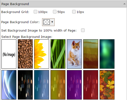
We can also select a background for the entire browser window. On the left click to expand the Page Background section.
Here are several background images that you can select from. The graphic above only shows you a few of the options. You can also add one to your library by clicking the Add button at the bottom of that section. That will walk you through the process of uploading an image from your computer. When I select a background option, it applies the image to the work area only. If I want the image to actually fill the browser window, I can check the box that says ‘Set Background Image to 100% width of Page’.
We can also choose a Background Color for the entire browser window by selecting a color from the Page Background Color field. If you want to change the background color of the work area, right click in that area and choose ‘Edit HTML.
The Background Grid options in this section allow you to turn on a grid that will aid in alignment of controls on the page. There are three sizes available. Select the one that you prefer. The grid will not show on your final web page.
More on Controls
As we mentioned earlier, there are controls that pull in text and photos from your giving option. However, you can add an image or text as well. In addition to the Confirmation Page specific types of controls you also have Generic Text, Generic Image, Generic Line, Generic Link, and Generic Expaner. These all work in the same way as those found on the
Donation Page and you can check them out there. However, it is likely that you will want to add a message to your donors to the Confirmation Page and to do that you can use the Generic Text control.
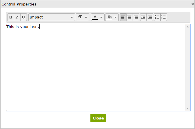
Generic Text: You can add text by clicking the Add button next to the Generic Text control. It will appear in the upper left and you can drag it to where you want it on the page. Now right click and choose Properties.
Click in the box and begin typing your text. A toolbar appears at the top to allow you to underline, bold, change fonts and colors, etc. just like you would in a word processor like Microsoft Word. Click Close to finish adding your text. Now you can format it further by right-clicking the control and choosing Edit HTML. You can change the size of the text box, align it left, center, or right, change the font style and size and also change the color of the text there. You can even add a background image to the text box.
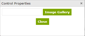
Generic Image: You can add an image or text as well. Click the Add button next to the Generic Image control to add that to the work area. It will appear in the upper left corner and you can drag it to where you want it to be. Now right-click on that control and choose Properties.
Click the Image Gallery button. You can select one of the images that are already in your library or you can click the Upload Additional Image button. You can then Browse and select the image you want to upload. Then click on it to select it and finally click Close. Notice that the image is scrunched into that original box. Right-click on the control and choose Edit HTML. Here you can set the height and width that we want for the photo. You can also drag the outline of the control to resize it that way as well. Now you can drag the control to any area of the page that looks best.
Generic Line: A Line is just a visual separator that you can use to create sections on the page. When you click to add a Generic Line, it appears on the page and you can drag it around and/or make it shorter or wider as needed.
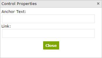
Generic Link: The Link allows you to put links to other web sites or web locations into your page. Click to add the Generic Link.
Enter the Anchor Text. This is the text that the donor will see on the page.
Enter the Link. This is the web page or email address for the link. When a donor clicks on the Anchor Text their browser will direct them to this page. You should enter it as http://www.website.com or mailto:email@domain.com.
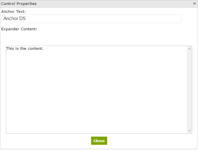
Generic Expander: Allows you to add text that when clicked on, expands and reveals more text. Click the button to add an Expander control to the page. Right-click on the control the Properties.
Enter the line that you want donors to see on the page in the Anchor Text field. Enter the text you want them to read in the Expander Content field and click Close. On the final web page, when a donor clicks on the Anchor text, the Expander text will pop up allowing them to read the full paragraph.
Layers: The concept of layers is an important one. All of the controls exist in one of three layers; bottom, middle, and top. The work area is, by default, at the bottom. When you add a new control, it is, by default, set to top. Let’s say that you want to take your image that you added and put a text box on top so that it looks like the text is sitting on the image. You can change the layer of the image to be bottom or middle and and then slide the text control, with it's natural top layer on top of that. The image will become the background for the text.
You can modify the layer in one of two ways.
-
You can, in the Layout Editor, right-click on the control you want to change and choose Layer. Select the layer you want for that control.
-
You can, in the Layout Editor, again right-click on the control but choose Edit HTML. That window also has a layer setting.
Both methods accomplish the same thing.
Control Functions
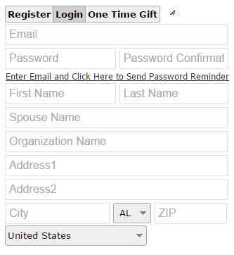
There are several controls that have some functionality built into them. For example, the ‘One Time Login or Register control is what the donor will use to enter their contact information.
They have the option to Register and enter their name and address information or Login if they've registered in the past. On the Login tab they can also click to send a password reminder to their email address. If they choose the Register option, the eDenari will create a name record for them and you'll find that record under the
Donors tab.
The Donation Amount control gives you amount buttons that the donor can choose from.
You can change the amounts by right-clicking and choosing Gift Handles. You also have the ability here to make the button alignment either horizontal or vertical and can change the button size and the color as well. The donor can also enter a miscellaneous amount in the Gift Amount box if they choose.
The Basic Donation control adds the Make Donation button.
This button finalizes the process so you’ll probably want to put that near the bottom of the page. It willl start the credit card transaciton process and create a gift record that you can see in the donor's Gift History section of their
Name Record.
In the Donation Controls section you will find the
Pledge control. It allows the donor to create an on-going donation. For example, they could choose to make a $20 per month donation. The program will create a Pledge record in the donor's Name Record. Each month, in this example, the program will transact the credit card pledge and create a gift record in the donor's
Pledge section of their
Name Record. The credit card processing company will, at the same time, make the $20 transaction and deposit the money into your bank account.
Also in the Donation Controls section you will find a
Tribute control. It is used for gifts 'In Memory Of', or 'In Honor Of'. Gifts given in this way are indicated on the
Thank You Receipt that you may send out later.
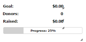
You’ll also find Giving Stats controls for tracking progress toward your goal for a giving option as well as some for tracking donor stats, etc.
You will find these controls in the Giving Options Controls section.
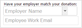
The Donate Double control adds fields to allow your employer to match your donation.
This feature works in conjunction with a third-party software called 'donatedouble.com'. It requires that you have an account there and that is where you will set up the pre-arranged relationship between your organization and the employer. The drop down field here is using the data that you've previously set up there by pulling in the list of employers. The donor/employee can then select his/her employer and enter their email address. An email will be sent to the employer inviting them to match the donation.
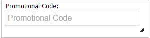
The Promotional Code control adds a field to allow the donor to enter a code that they may have received from a friend or family member.
Your friends have the option to purchase a
Donation Gift Card at the time they make their donation. It can be redeemed as a charitable donation.
Publish Your Page
Once you have your Donation Page looking the way you want you are ready to make it available to your donors. Move to the Live page field in the Manage This Page section on the left.
Copy the URL you find here and make that a link on your web site. Donors can click that link to make their donation through eDenari. Their name and address information will be recorded along with the gift information in the
Donors section. The credit card processing company will process the transaction and put the money into your bank account. When the donor clicks the Make Donation button, they will next see the
Confirmation Page that you have selected in the Confirmation field.